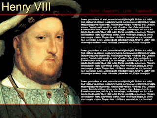
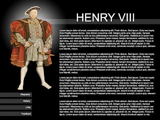
After doing my initial thumbnail designs, I've narrowed my choices down to 5. So that my group can see more detail about these five designs, I've drawn up a basic screen of each one in Photoshop. I have created a poll to see which one people like best. Please feel free to leave feedback as to which one is your favourite and why, this will help me to develop my final one.
(click on image to see larger version)

^Screen Design 1
^Screen Design 2
^Screen Design 3
^Screen Design 4
Thanks for reading.
Sue


6 comments:
These screen designs really show some potential.
Personally I would choose either screen design 3 or 5, although there isn't much contrast between the links and the background colour in design 3.
The colours used in design 4 seem to be the wrong choice of colours. I would stick with the same colours you have used in the other designs.
I look forward to seeing which of your designs you choose to be your final, and how you develop it.
Thanks marc, I completely agree with the contrast of the links on screen 3, hopefully if this one is chosen to be developed I can sort that out!
Thanks for the feedback!
I like the image in design 5 it gives it a lot of presence with the white effect behind. But I know light text over a dark background is hard to read for the target audience, I think I would put a box around the whole body text and change the text colours around.
I also like the symmetry of design 3. The black and red give it a very professional fell. I don’t think blue and green works for design four. If I were to pick id go with idea number 3.
Thanks richard!
My favourite is design 3 also. But like you've already mentioned the text colour may be unsuitable. Also, the navigation at the top of the page cannot be seen properly due to contrast issues. If i choose this one, these will have to be developed further.
I would choose screen design 2! This is for accessibility reasons mainly because personaly i prefer 3 however some people can not read white text on black background.
hey very nice work, but personaly i would chose design 5, despite steve's dislike to white text on a black background. To me this one shows a great deal of talent and i beleive that this should be shown in any website (damn those clients who chose to be so simple minded).
Post a Comment