
As mentioned in my previous post, here are my screen designs for Back to BASIC.
(There will eventually be five, so please bear with me. These will be posted online very very shortly!
Sorry for the 'wonkiness' of some of them!)
 [Screen Design 1]
 [Screen Design 2]
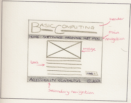 [Screen Design 3]
 [Screen Design 4]
Please feel free to leave any formative feedback.
Thanks,
Sue.

4 comments:
Id like both of them.
I think for the target audience design 2 would be more appropriate! It just seems more logical.
I like the alignment of the first one, how many terms are you putting on one page?
It could look good if you got rid of the angled line at the bottom of it and went straight down having all the terms in that same alignment. Like one big zig zag down to the bottom.
nice work!
--------------------
This may also be a good place to plug my new post of revisions. =) go visit my blog! =)
When you think about the target audience, I reckon either design 2 or design 3 would be more appropriate. They're much simpler and therefore are more easily understood.
Personnaly I like design number 2 but I am not to sure about the colour scheme. I think that the colour scheme from the first design is much clearer and more inviting.
I think the navigation on the second design would be easy to use and it suits the target audience well.
I feel there is only the one design that will really work here. Design No. 2 – Keeping it simple for the target audience is vital.
With the exception of designs 2 and 3, all the other designs will create quite large file sizes.
Post a Comment